Science and the Web 2.0
A blog on Science 2.0 research
Behind the TEL Tweet Visualizations
If you have been to a TEL event recently, you might have already seen our Tweet Visualizations in the domain of TEL. Stefanie Lindstaedt will be presenting our paper entitled "On the Way to a Science Intelligence: Visualizing TEL Tweets for Trend Detection" at EC-TEL 2011 on Wednesday. I thought this was a good occasion to tell you a bit more about the background of the visualizations. I should not forget to mention that the system was built in a joint project between Know-Center and Joanneum Research in the context of the STELLAR Network of Excellence. Most of the stuff below is taken from our paper, if you want to know more, you can access the preprint here.
Architecture
Below you can see the architecture of the system. We developed a focused Twitter Crawler, which takes as input either a taxonomy of hashtags, or a list of users, or both. It then queries the Twitter Streaming API for matching data. This allows for adapting the system to a certain domain. The tweets are logged, cleaned, and informative tokens (such as nouns and hashtags) are extracted using TreeTagger. Finally we store the tweets, their metadata, and their associated informative tokens in a Solr index. Therefore, one can access the real-time data, but also go back in time. At the moment, this works only for a couple of weeks, but we are in the process of widening this timeframe drastically.
The Visualization Dataservices are REST-ful Webservices, which translate the search query into a Solr query and preprocess the Solr result in different ways: the Streamgraph Dataservice focuses on analyzing the temporal evolution of topics over time; the Weighted Graph Dataservice focuses on relations between different topics. The dataservices are used to power two visualizations. One is a weighted graph, a co-occurrence network for analyzing semantic networks of terms based on the JavaScript InfoVis Toolkit (JIT).
Visualizations
Below you can see the Weighted Graph Visualization for the hashtag of the 2nd STELLAR Alpine Rendez-vous.
In the center, there is the official hashtag for the event #arv11. The hashtags which are directly related to the event hashtag, are hashtags of individual workshops, such as #datatel11 for the dataTEL workshop, and #arv3t for the workshop "Structuring online collaboration though 3 Ts : task time & teams". Co-occurring with the individual hashtags are hashtags that describe some of the content of the workshops, such as agency and PLE for the 3T workshop.
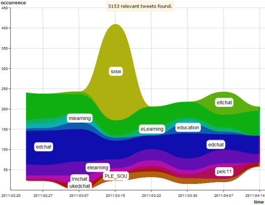
The second visualization is a streamgraph based on the Grafico javascript charting library for analyzing trends over time. The graph below shows a screenshot of the Streamgraph Visualization, displaying the co-occurring hashtags for the query "conferences" from 20/2/2011 to 14/04/2011. On the x-axis, the time intervals are outlined, whereas on the y-axis, the relative number of occurrences is shown. Each colored stream represents one co-occurring hashtag. The visualization shows that the hashtag for the South-by-Southwest conference (#sxsw) is trending around the actual event on March 15. The #pelc11 hashtag was trending around April 7, with the Plymotuh E-Learning conference taking place from April 6-8. Another conference that is trending is the PLE Conference in Southhampton (#PLE_SOU), which took place later but generated a lot of tweets even before the event. The other co-occurring hashtags are not tied to a certain conference (such as #mlearning and #edchat), but they denote hashtags in the TEL area which contain a large amount of tweets about conferences. These hashtags could be used to find out about further conferences in the area.
Due to the fact that the user interface relies on web standards, the visualizations can be easily included in any system that relies on those standards. Apart from the main website http://stellar.know-center.tugraz.at/vis, versions of the visualizations are also available as widgets in TELeurope.
Reception and Outlook
We are quite pleased with the reception of our system. The visualizations have been used as a support in the dataTEL workshop (#datatel11), the RDSRP'11 special track at i-KNOW (#rdsrp11), and the SURF Learning Analytics Seminar (#sa_la). Participants liked the look of the visualizations, and the idea behind them. The system will also be employed as a reflection tool in the Workshop on Awareness and Reflection in Learning Networks (#arnets11) at EC-TEL 2011.


No hay comentarios:
Publicar un comentario